A · Say who it’s for
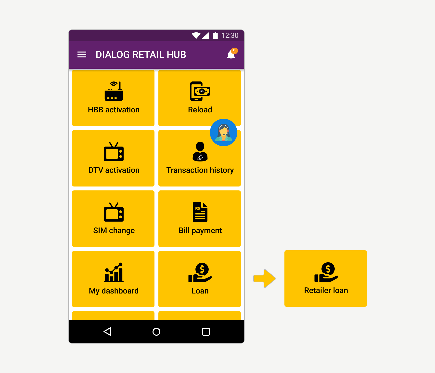
“Loan” became “Retailer loan”
One retailer read the tile as a way to give loans to his customers. Two words fixed the audience.
Case study 02 · Fintech inside a B2B2C app
A loan for small retailers whose businesses were hit by COVID-19 and Sri Lanka’s economic crisis. The backend could only take English, so every word had to work for someone reading in their second language.
01
Retailers use Retail Hub every day to sell reloads, activate SIMs and take bill payments. Many had been hit hard by COVID-19 and then the economic crisis. Dialog’s finance subsidiary proposed a loan, applied for in Retail Hub and repaid automatically from the retailer’s One wallet, to help them get back on their feet.
The borrower is the retailer, not their customers. That sounds obvious, but it turned out to matter.
The constraint
English only
Retail Hub is available in Sinhala and Tamil, but the loan system behind this flow could only handle English. Translation wasn’t an option, so the English itself had to be simple enough for most retailers to follow.
02
I designed the flow, built a high-fidelity prototype from the development-ready screens, then planned and moderated the tests. The prototype covered the happy path only, so the study tested comprehension and expectations, not edge cases.
One session ran in a retailer’s shop in Pettah, Colombo. The other four ran live and remotely, with regional supervisors setting up each retailer on site. Every session was moderated by the UX team.
Four questions
Understand
Can they make sense of the form fields and guidance?
Anticipate
What do they expect from the feature?
Perceive
How do they feel about it?
Use
What usability issues get in the way?
03
The headline
Underneath
They could get through the form. They were misreading what it asked.
Most were surprised a guarantor was needed. Some felt Dialog already knew their business, so why ask? Tax and PEP questions came from nowhere. One retailer thought he’d be lending to his customers.
04
The field
Monthly income
Retailer A read it as
“My Dialog sales each month”
Retailer B read it as
“My whole shop’s income”
Retailer C read it as
“All of my income”
The field got answered every time, just with three different meanings. A task-completion test would call that a pass. For a lender, it’s three different numbers.
That became the lens for the rest of the analysis: not only can they fill it in, but what do they think it means. The same pattern showed up in “Surname” and “Other names as per NIC”, words that looked familiar but were read differently.
05
Some terms were simply unfamiliar banking language. Others looked familiar and were read the wrong way, which is harder to spot.
Unfamiliar
Familiar, but misread
How the wording changed
06
I proposed every change and took them to a forum of the business owners, who agreed them. Words were only part of it. These six fixed how the screens behaved.
A · Say who it’s for
“Loan” became “Retailer loan”
One retailer read the tile as a way to give loans to his customers. Two words fixed the audience.
B · Don’t make it feel like a new account
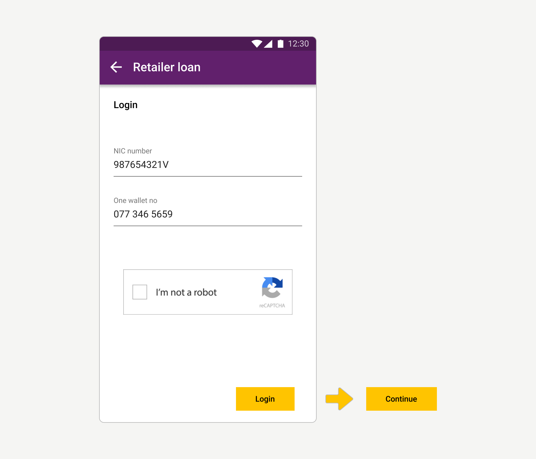
“Login” became “Continue”
Retailers were already logged in to Retail Hub. A second “Login” made them unsure which number to use. Now it reads as the next step: “Enter your NIC number & One wallet number to continue.”
C · Put the deal-breaker first
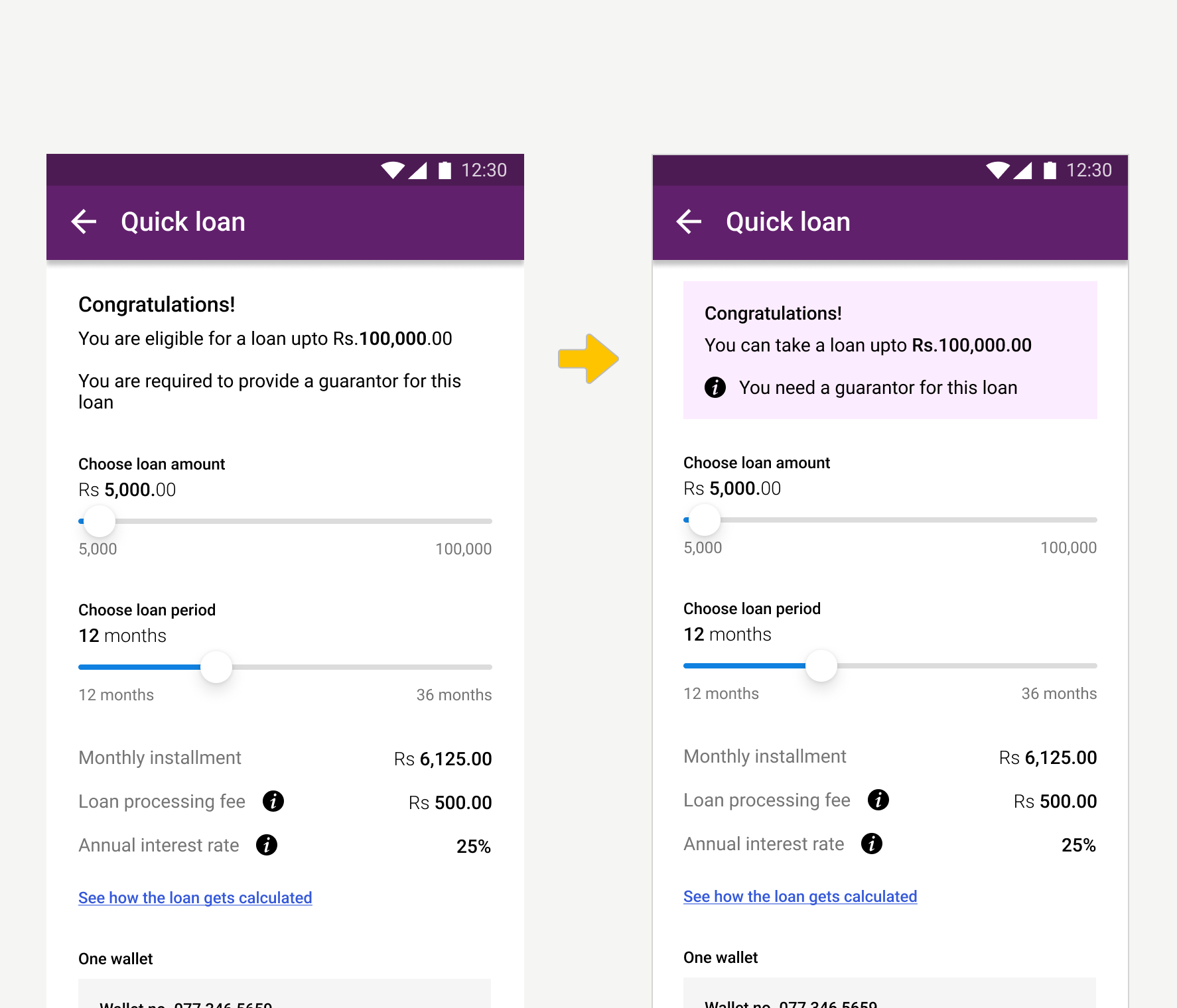
The guarantor rule moved up and stood out
Retailers skipped it or only saw it when asked, then got surprised later. It now sits in a highlighted panel at the top, in plain words.
D · Read-only should look read-only
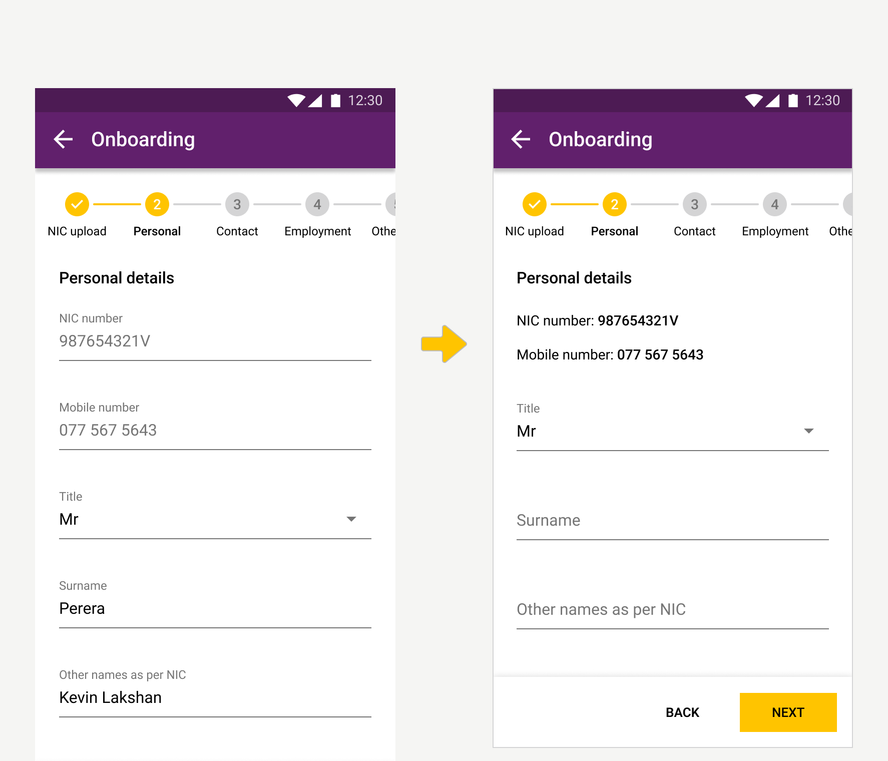
Disabled fields became plain text
Retailers tried to fill in the greyed-out NIC and mobile fields, or asked if they had to enter them again. Showing them as “NIC number: 987654321V” ended the question.
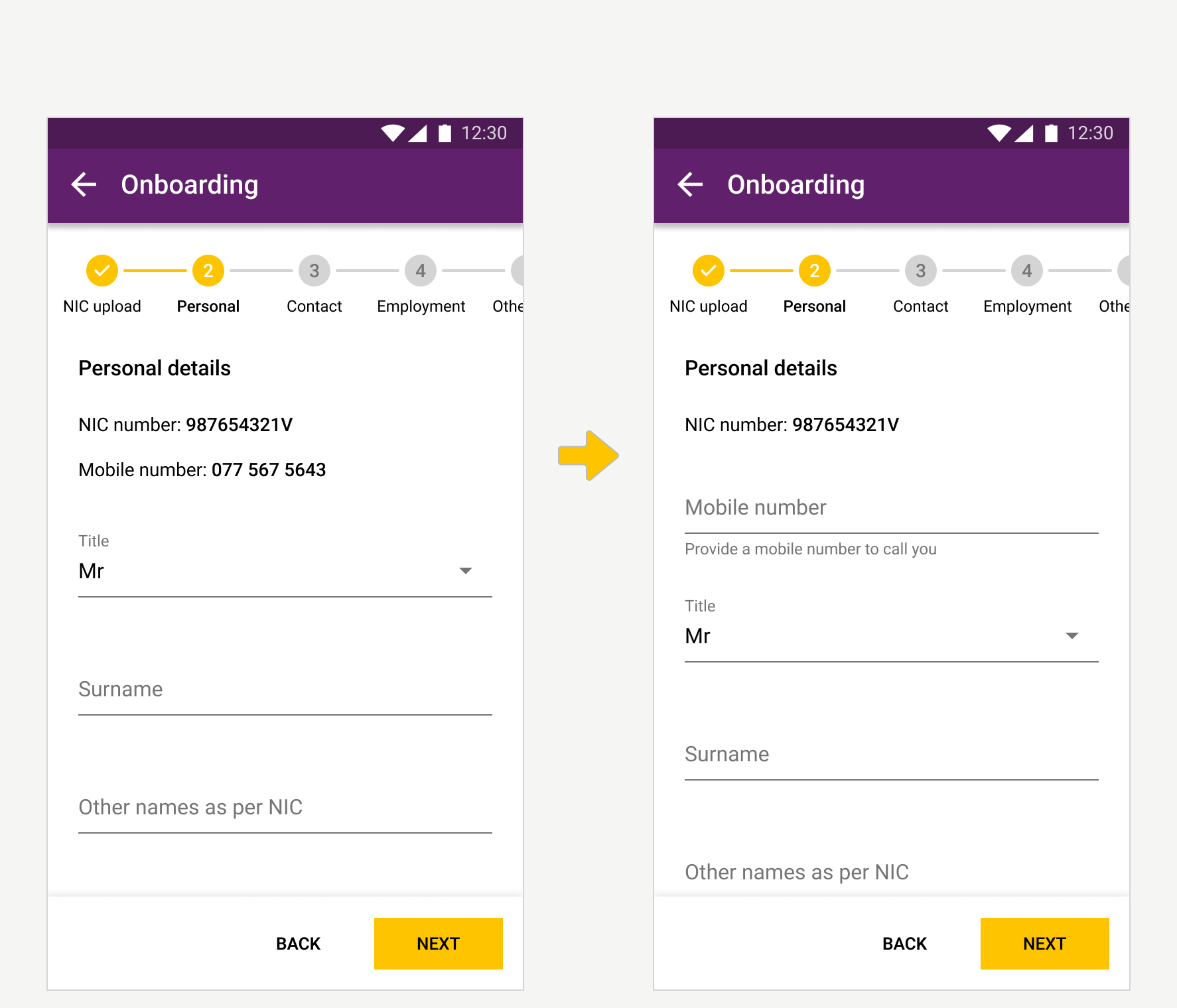
E · Design for the shop
Ask for a number we can actually call
The number that passed OTP is often a SIM inside a reload machine. It can receive a code but no one answers it. The form now asks: “Provide a mobile number to call you.”
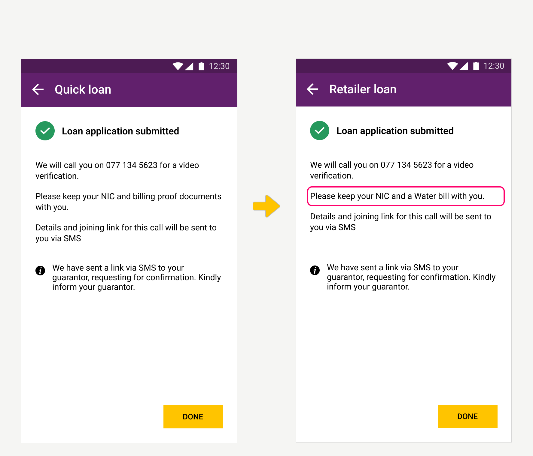
F · Say exactly what to prepare
“Billing proof” became the actual document
The success screen now names the document the retailer chose earlier, such as “Please keep your NIC and a Water bill with you”, ready for the video verification call.
Figma · Research board
See the findings, every screen and each change side by side
The research matrix, the before and after screens, and the decisions as they were agreed.
07
Rewording a confusing question helps. Removing a question nobody needs to answer helps more. Retailers kept saying Dialog already knew them, and they had a point.
The “Other information” step was removed from the app. US tax, PEP and account-purpose questions confused most retailers, and some answered “No” without understanding them.
Account purpose fixed to “Loan repayment”. The account only exists to repay the loan, so the retailer shouldn’t have to choose.
Employment questions challenged. Retailers coming into this flow are already vetted by Dialog, and some saw these questions as redundant. I asked whether they could be fixed values or pulled from the retailer’s existing profile.
08
Agreed
15 changesRaised, not decided
OpenLogged with the business owners so they weren’t lost.
09
The design was finalised in October 2022 and went live around September 2023, once the backend was ready. [ADOPTION OR APPLICATION NUMBERS, IF YOU CAN SHARE THEM]
What I took from it
A clean usability result can hide a comprehension problem. Now I ask people what a field means, not just whether they can fill it in.
For Homey
Conveyancing is full of the same kind of words. “Disbursements” is on every quote, and onboarding asks about source of funds and politically exposed persons. Buyers and sellers aren’t lawyers, and many are doing this for the first time.
The approach carries over: test what people think a question means, cut what you already know, and tell them exactly what happens next.
Case study 01
A scalable KYC module for a TRCSL-regulated telco